Choosing the right paint colors for your home can transform your living spaces, evoke specific moods, and reflect your personal style. The science of color plays a crucial role in how we perceive and interact with our environments. By understanding color theory and considering the function of each room, you can select paint tones that enhance your home’s aesthetic and atmosphere. Here’s a guide to choosing paint tones for every room in your home.
Understanding Color Theory
Color theory is the foundation for creating harmonious and visually appealing spaces. It involves the use of the color wheel, which organizes colors in a circular format to illustrate relationships between primary, secondary, and tertiary colors.
Primary Colors
The primary colors—red, blue, and yellow—are the basis of all other colors. These colors cannot be created by mixing other colors together and serve as the starting point for color mixing.
Secondary Colors
Secondary colors are created by mixing two primary colors. For example, red and blue make purple, blue and yellow make green, and yellow and red make orange. These colors provide a broader palette for design and decoration.
Tertiary Colors
Tertiary colors are created by mixing a primary color with a secondary color, resulting in hues such as red-orange, yellow-green, and blue-purple. These colors add depth and variety to the color wheel.
Color Harmony
Color harmony refers to the pleasing arrangement of colors. Harmonious color schemes are visually appealing and create a sense of balance. Common color harmonies include complementary, analogous, and triadic schemes. Understanding these relationships helps in selecting colors that work well together in a room.
The Psychology of Color
Colors have psychological effects that can influence mood and behavior. When choosing paint tones for different rooms, consider the emotional impact you want to achieve.
Warm Colors
Warm colors, such as red, orange, and yellow, are stimulating and energetic. They can make a room feel cozy and inviting. These colors are ideal for social spaces like living rooms and dining rooms where you want to encourage interaction and activity.
Cool Colors
Cool colors, including blue, green, and purple, have a calming and soothing effect. They are perfect for bedrooms and bathrooms, where relaxation and tranquility are desired. These colors can also make a space feel larger and more open.
Neutral Colors
Neutral colors, such as white, gray, beige, and taupe, are versatile and timeless. They provide a subtle backdrop that allows other design elements to stand out. Neutrals are suitable for any room and can be easily updated with accessories and accents.
Choosing Paint Tones for Each Room
Selecting the right paint tones for each room involves considering the room’s purpose, lighting, and existing décor. Here’s how to approach choosing colors for various spaces in your home.
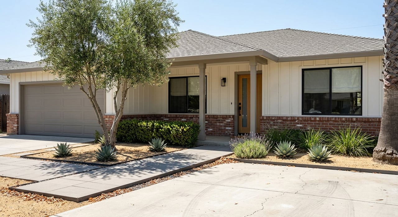
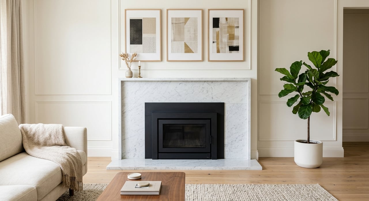
Living Room
The living room is often the central gathering space in a home, so it should feel welcoming and comfortable. Warm colors like soft yellows, warm grays, and light browns can create a cozy atmosphere. If you prefer a more vibrant look, consider accent walls in shades of deep red or burnt orange. Natural light plays a significant role in the living room, so test your chosen colors in different lighting conditions to see how they change throughout the day.
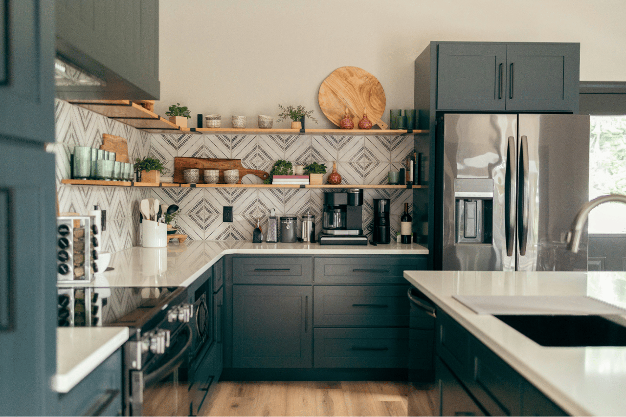
Kitchen
Kitchens are active spaces where bright and lively colors can energize the environment. Whites and soft grays create a clean and fresh look, while shades of yellow and green can add a cheerful and refreshing touch. Consider using a bolder color for an accent wall or backsplash to make a statement. Since kitchens often have various surfaces and materials, choose a paint color that complements countertops, cabinets, and appliances.
Dining Room
Dining rooms benefit from colors that stimulate appetite and conversation. Rich tones like deep reds, warm golds, and elegant purples can create an inviting and sophisticated dining experience. If your dining room is part of an open floor plan, ensure the color transitions smoothly with adjacent spaces. Accent colors can be used in table settings and artwork to tie the room together.
Bedroom
Bedrooms are personal sanctuaries where restful and calming colors are ideal. Soft blues, gentle greens, and muted purples promote relaxation and sleep. Neutral tones like beige and light gray also work well, providing a serene backdrop that can be personalized with bedding and accessories. For a more dramatic look, consider a dark accent wall behind the bed to create depth and coziness.
Bathroom
Bathrooms are spaces for rejuvenation, and the colors should reflect a sense of cleanliness and tranquility. Cool colors like aqua, seafoam green, and soft lavender are perfect for creating a spa-like atmosphere. Whites and light grays are also popular choices, offering a crisp and fresh appearance. Pay attention to the size of the bathroom; lighter colors can make small spaces feel larger and more open.
Home Office
The home office requires colors that boost productivity and focus. Shades of blue and green can enhance concentration and creativity. If you prefer a more neutral palette, consider soft grays or beiges with colorful accents. Personalize your workspace with artwork and decor that inspire you, ensuring the overall color scheme remains cohesive.
Hallways and Entryways
Hallways and entryways are transitional spaces that set the tone for the rest of the home. Light and neutral colors like off-white, pale gray, and soft beige can make these areas feel open and inviting. For a touch of personality, consider a bold color for the front door or a striking wallpaper pattern in the entryway. Ensure the colors flow seamlessly with adjoining rooms for a harmonious look.
Testing Paint Colors
Before committing to a color, it’s essential to test it in your space. Purchase sample sizes of your chosen colors and paint small sections of the walls. Observe how the colors look at different times of day and under various lighting conditions. This process will help you make an informed decision and avoid costly mistakes.
Sample Boards
Using sample boards is another effective way to test colors. Paint large pieces of cardboard or foam board with your chosen colors and move them around the room. This allows you to see how the colors interact with furniture, flooring, and decor from different angles.
Lighting Considerations
Lighting significantly affects how colors appear. Natural light brings out the true color, while artificial lighting can alter the perception. Consider the type of lighting in each room—warm or cool bulbs—and how it influences the paint color. Testing colors under the actual lighting conditions in your home will ensure you achieve the desired effect.
The Lupe Kemper Team: Your Martinez Real Estate Experts
Choosing the right paint colors for your home is both an art and a science. By understanding color theory, considering the psychology of color, and testing your options, you can create beautiful and harmonious spaces that enhance your living environment. For personalized advice on home improvements and expert guidance in Martinez, CA real estate, reach out to the Lupe Kemper Team. Their deep knowledge of the Martinez real estate market and commitment to client satisfaction make them the perfect partner for your journey. Contact the Lupe Kemper Team today to learn more about how they can help you achieve your real estate goals.